Seamless work: Virtually seamless concrete slabs in the north and east elevations, with more concrete marking the cafe and roof terrace on the south elevation
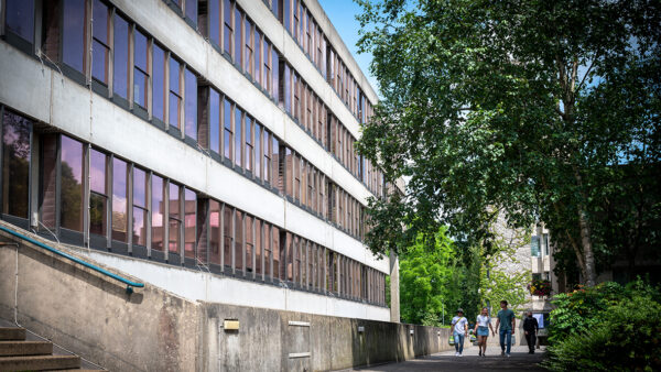
Five minutes from the bustle of Cambridge station, and I’ve arrived at what surely must be one of the most idyllic building sites in the world. The Sainsbury Laboratory stands in a corner of the Cambridge University Botanic Garden, a lush green landscape of exotic-looking trees, blossoming flowers and pungent herbs. Set against this verdant backdrop, the two-storey lab building is rock-solid and angular, defined by its long letterbox-like elevations of sandy-coloured stone pillars, sandwiched between paler bands formed by the exposed concrete slabs.
Due to be completed at the end of the year, Kier Build’s scheme will be a state-of-the-art plant research centre for 120 of the world’s top botanical scientists, working with thousands of rare plant species. Their new environment is defined by a sculptured concrete frame, cast in-situ with virtually no visible construction joints and without a single movement joint. This ambitious requirement came from architect Stanton Williams, which aspired to create a solid monolithic structure that would appear to be rooted in the garden.
To build the concrete walls and floor slabs, which at first floor level cantilever out beyond the perimeter wall to create shaded overhangs, the construction team became architectural cosmetic surgeons. The layout of the shuttering boards was meticulously planned to conceal joints between sections, and innovative construction techniques were devised that would allow them to erect large concrete elements without leaving visible scars from bolt holes and fixings.
Casting in-situ meant getting everything spot on first time round, says Simon George, director of concrete frame contractor Whelan & Grant. “Before any pour could go ahead we had to make sure everything was absolutely right, there are no second chances. We had what might be considered an excessive number of engineers on the site, eight at one point, to implement the checking regime. We even had people checking the people doing the checking!”
The Sainsbury Laboratory stands at the eastern corner of a 40-acre historic botanic garden set out in 1831 by John Henslow, the tutor and mentor of Charles Darwin. It is being built for the University of Cambridge for around £80m and includes laboratories, support areas and meeting spaces, plus a new public cafe and seminar room.
The building is roughly U-shaped in plan, wrapping around a courtyard that is open to the botanic garden on its fourth side. Apart from concrete, the building makes extensive use of a sandy-coloured limestone sourced from Metz in France, used both as a rainscreen cladding and to create rows of non-structural columns along the north and east elevations.
With the exception of the publicly-accessible ground floor cafe, which sits underneath a cantilevered concrete terrace on the south elevation, the Sainsbury Laboratory will be the exclusive preserve of research scientists and their support staff. A third of the building is actually submerged below ground, to house the University Herbarium, a collection of over a million pressed and dried plant specimens from all over the world, including those collected by Darwin on the Beagle.
Above ground, the architect has given the staff a double height “thinking path” with floor-to-ceiling glazing connecting them to the garden and the source of their inspiration. At ground floor, this takes the form of an internal street, enclosing two sides of the courtyard and conceived as a latter-day cloister. The street will eventually extend outside of the building, into pathways within the botanic garden.
At first floor level the street becomes an elevated concrete walkway, structurally separate from the main first floor slab, which spans a double-height atrium. On the courtyard side, concrete bridges lead from the walkway to “thinking spaces” for private or group work. The walkways also give access to the main working spaces and laboratories on the first floor, where roof lights supply natural daylighting.
The twin concepts of permeability and solidity dictated the use of concrete, says Gavin Henderson, director of Stanton Williams: “Our goal was to create a building with a sense of solidity and permanence, which we wanted to have a very long lifespan, which concrete can provide.
“Simultaneously it was important to emphasise the connection with the garden by blurring the boundaries between outside and inside, using external concrete in the foyers and other rooms and creating large concrete cantilevers that reach out into the garden. We didn’t want any obvious abrupt walls between the outside and inside.”
During the early design stages, the contractor and design team considered the use of pre-cast concrete but soon realised cast in-situ architectural concrete, supplied by Lafarge, would allow them to reduce the number of joints and detailing and create a solid purity of structure.
“Pre-cast could only be delivered in certain modules, but we couldn’t see how to deal with all the joints when trying to achieve a monolithic structure,” says Kier’s project manager Nick Mann.
Kier then approached several concrete sub-contractors to devise an appropriate method for casting in-situ, but most dropped out, fearing the consequences of such a high-profile project going wrong. Whelan & Grant was selected based on its innovative solution and its willingness to run the course.
Seamless surfaces
Creating virtually seamless concrete surfaces meant carefully planning the length of sections of poured concrete so that the joints between different pours would align with the joints between the plywood shuttering boards, reducing the number of visible lines left on the surface.
“The layout of the construction pour joints didn’t always tie in with what a structural engineer would want,” adds Whelan & Grant’s George. “Traditionally you’d have a joint every third of the way along a span, but we had to vary it to make sure the reinforcement, board joint and construction joint all aligned perfectly. It was like building by numbers a section at a time.”
Casting the first floor slab proved a particularly tough challenge. The architect wanted a discrete and thin slab, with fair-faced soffits and no visible downstand beams, bolts or fixings. However, the slab also had to be strong enough to cover large spans, over the lecture theatre for example, and create unsupported cantilevers around the building’s perimeter. Concealing the supporting beams was resolved by incorporating the downstand beams within the thickness of the slab using reinforcement cage, but that still left the problem of minimising the slab’s thickness.
Whelan & Grant’s solution was to cast polystyrene blocks into the slab to reduce its weight. But using polystyrene posed another conundrum – how to secure the polystyrene blocks in position during the concrete pour without using bolts? “Normally you would bolt the polystyrene in position through the deck to stop it rising during the pour, but this would create lots of exposed bolt holes along the soffit,” explains George.
The solution was to pour the slab in two layers. First, a thin 100mm-thick concrete “biscuit” was poured to create the soffit. Once this had cured, the polystyrene was fixed to it, reinforcement cages were installed, and the main body of concrete was poured.
Spread thin
“We’ve never done a layer as thin as 100mm with architectural concrete,” says George. “It was very exciting when we struck out the first section because it’s tricky to pour something that thin, vibrate it to get rid of air bubbles and ensure a consistent surface finish.”
Similarly, close attention was paid to corner details where the slab edges meet with vertical walls. “Traditionally you would pour the slab, create a kicker [an upright section forming the base of the wall] and then pour an upstand, which creates three joints, and wouldn’t look good. We devised a way to pour the slab slightly higher so that the kicker forms part of the slab edge, leaving only one visible joint,” adds George.
As the concrete pours progressed, an attitude of healthy competition was instilled in the team, who were encouraged to give the same attention to detail on areas of covered up concrete as they would on fair-faced areas.
“The guys really got into it. Each time a section of wall was struck out people would gather round to rate the result, then on the next pour the guys would try to do it even better,” says Kier’s Mann. “It’s really satisfying to see people take that level of pride in their work.”
Inside the building, the team’s efforts are shown to good effect in the large laboratories, column-free spaces which feel light and spacious. These are top-lit from roof lights, with the light funnelled into the space via curved white reflective panels fixed to the concrete ceiling beams. The perforated panels also boost acoustic absorption.
But the most striking achievement is on the building’s exterior. As I stand at the corner of the building and stare along its longest 80m elevation, the surfaces appear as flat and smooth as a razor, as if the building has been formed from a solid block of concrete with a ruler and scalpel. It’s an impressive achievement, and one which will convey a sense of solidity and permanence in a garden setting that changes by the day.
Curing a structural problem
A complex structural propping solution was required during construction of the first-floor concrete walkway, which turns the corner between the north and east wings (top and right on the plan, right). It runs through a double-height space, but is enclosed in glazing. On the courtyard side, the walkway supports a row of structural steel columns, which provide support for the huge roof cantilever over the atrium void.
However, the walkway itself is supported at ground level by only a few widely-spaced concrete columns, so huge amounts of propping had to
be installed to take the full weight of the roof before the concrete had cured.
Kier project manager Nick Mann explains the effect: “The ground floor columns under the street were so sparse there was a huge cantilever effect, as the whole structure, forced down by the roof cantilever, was trying to rotate and come away from the building.
“Until the first floor and roof slabs had cured the structure wasn’t self-supporting, so we needed some very hefty propping to take all of that weight. We had to install propping and shoring throughout the double height atrium to the roof, and underneath and above the walkway.”
Key
1 Concrete walkway
2 Laboratories
3 Offices and admin
4 Roof terrace (above ground floor cafe)
5 Courtyard

Above: Shuttering, propping and polystyrene blocks on the ground floor slab as the concrete pours progress

The airy top-lit labs are accessed from a concrete walkway


